STUDIORA
Helping parents find and book the best tutors for their children.
Goals
So it got me thinking: how can I help busy, working parents effectively manage their children's tutoring and educational needs in a way that feels efficient, supportive, and straightforward?
Goals that influenced my design process:
Simplify scheduling and communication to reduce stress.
Make it easy for parents to track progress and hold children accountable.
Create a direct, efficient communication channel between parents and tutors.
Background & Motivation
Balancing work and parenting is no small feat - especially when it comes to managing a child’s education. In the Google UX specialization, I was drawn to a project prompt about building a platform to help busy parents support their kids’ learning.
For me, this hit home. Growing up, I watched my single mom navigate the constant struggle of balancing work with arranging my extracurriculars. That experience really opened my eyes just how tough it is for working parents to handle all the coordination needed for their kids’ education.
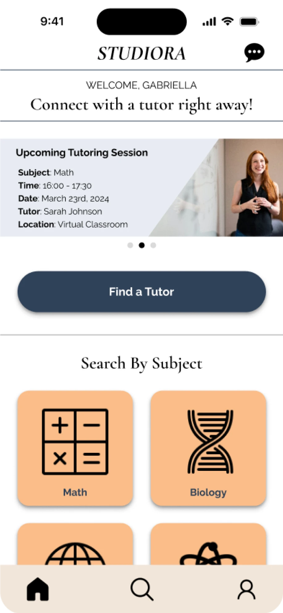
What is Studiora?
Studiora is an app designed to simplify managing children’s tutoring sessions for busy parents. It provides a centralized platform for scheduling, communication, and progress tracking, helping parents efficiently oversee their children's educational journey.
Role
UX/UI Designer
Type of Project
Conceptual Case Study
Duration
6 Weeks
Platform
Mobile iOS App

Common Pain Points
The interviews and subsequent affinity mapping clarified several pain points for parents who have tried unsuccessful or inefficient methods to improve their children's extracurricular activities. These pain points include:
Fragmented tools for tracking and scheduling: Parents find it hard to keep up with their children's progress because they have to use many different tools and platforms, which is inefficient.
Booking difficulties: Setting up tutoring sessions takes a lot of time and effort, which is challenging for busy parents.
Price vs. quality dilemma: Parents struggle to find tutors who are both good at teaching and affordable. They often have to choose between quality and price.

User Research
For the first bit of user research, I sat down with three local participants who matched the target user profile. My goal was to understand their daily struggles, needs, and motivations regarding their kids' education and tutoring. I wanted to capture the bigger picture and identify real pain points. Each participant had a unique family setup, time constraints, and views on tutoring.
One of the conclusions was that it’s not that parents don’t want to bother with their children’s tutoring process and remind them about extracurriculars. They just need a more streamlined way of doing it so the process isn't fragmented across several platforms.
Challenges as a Designer
As this was one of my first UX projects, I faced quite a few challenges with this project:
Limited research: I only had time to interview just a few users. This small sample made it hard to be sure about my design choices.
Assumptions: Because I couldn't talk to as many real users, I had to use online research and make some educated guesses and design thinking backed decisions about what the user might need.
Balancing features: I wanted to include many helpful features without making the app too complicated or visually bloated for users.
Time management: Balancing time between perfecting details and maintaining a holistic view was a pretty big challenge.
Despite these difficulties, I learned how important user research and feedback are in creating good designs. This project showed me that talking to real users and testing designs thoroughly are essential in making an app that truly helps people.

How-Might-We’s
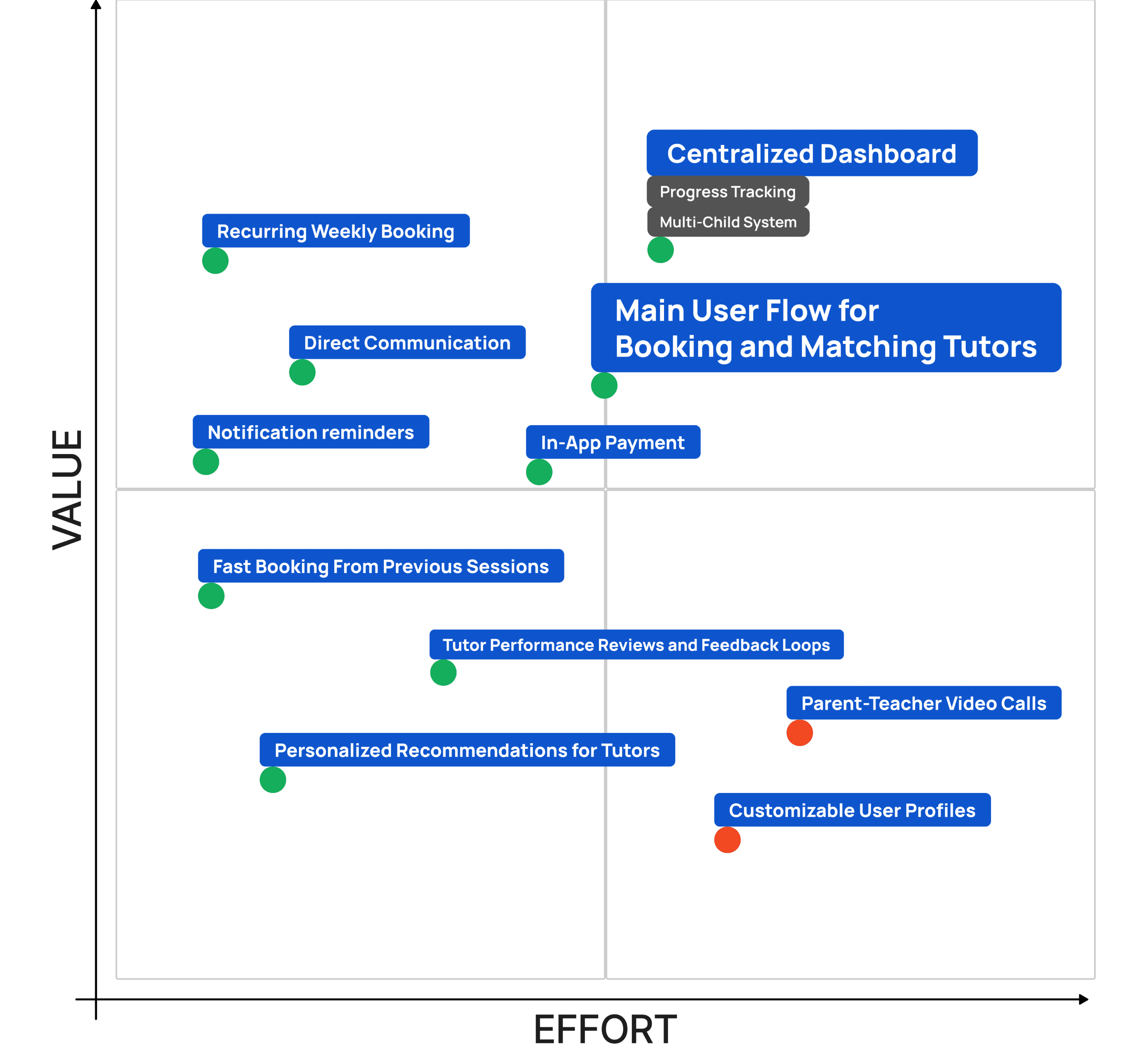
My findings uncovered significant challenges parents face in managing their children's tutoring experiences. From inefficient progress tracking to cumbersome scheduling and fragmented communication, these tasks were time-consuming creating barriers for parents. These insights led me to ask critical questions:
How might we combine the process of tracking tutoring sessions, progress, and homework in a single platform?
How might we make the search and booking of tutors faster and more intuitive for parents?
How might we enable real-time communication between parents and tutors for a smooth experience?
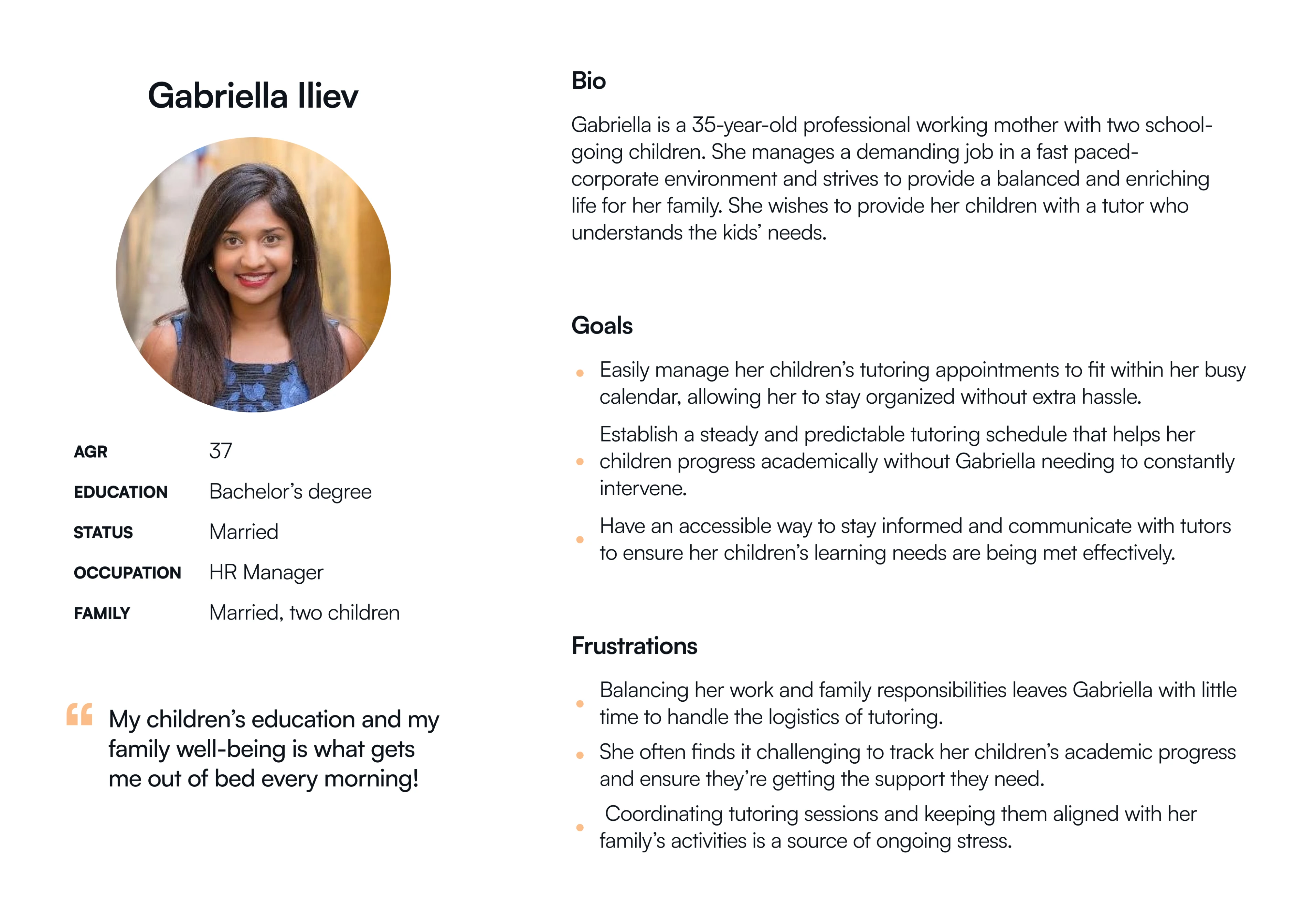
User Persona
To make sure the app really meets parents’ needs, I put together a User Persona based on what we learned in the interviews so far.
This persona helped me keep the design focused on the real challenges parents face.


Icons
home
profile
chat


Visual Branding
Color Schemes

Neutral
Secondary
Primary
Typography
Text Typeface:
Weight:
Size:
Satoshi
Bold
Medium
Regular
Heading H4
24px / 32px
Heading H5
20px / 28px
Body Large
16px / 24px
Body Medium
14px / 20px
Body Small
12px / 16px
OVERLINE (CAPS)
14px / 20px
Button
16px / 24px
Logo
Logo Typeface:
Light & Dark Versions:
CORMORANT GARAMOND
STUDIORA
+
=
STUDIORA
STUDIORA
+
=
STUDIORA
Components
STUDIORA
9:41
home
chat
profile
Top & Bottom Navigation
Notifications
AB

Javier Torres (Spanish) has scheduled a session for Jasmine on
April 16th 16:00 - 17:00
Accept
Decline
55m

Priscilla Davids has confirmed the session date April 15th 17:00 - 18:00
2m
Tab Bars
Session
Bio
Reviews
Child #1
Child #2
Child #3
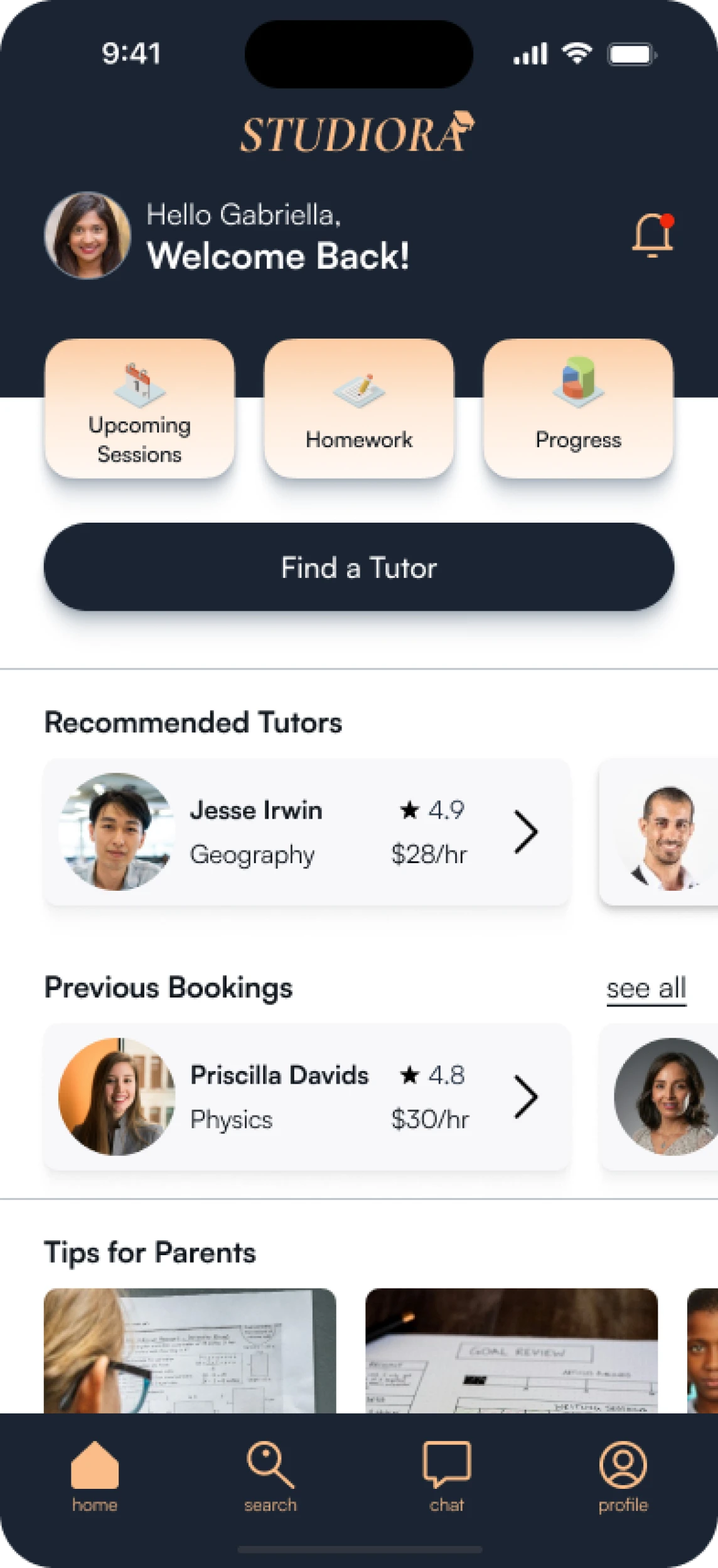
Cards
Physics session

April 15th
17:00 - 18:00
Olivia w/ Prof. Priscilla Davids
see details

Priscilla Davids
4.8

Physics
$30/hr


6th grade
Olivia
Needs help with: Physics, Spanish
Message Bubbles
16:05
Thanks a bunch! 🙌 I’ll definitely give those articles a read. Your proactive approach is much appreciated. Looking forward to our discussions!

16:04
Hi Gabriella, I've scheduled a video call for your child's next tutoring session. Please share this link with your child to join the session: [Video Call Link]. Thank you!
Buttons
Button
Button


Experience the Prototype
Learnings
Working on Studiora has been a transformative experience. Transitioning from the world of architecture and spending many months learning and creating in the field of UX, I’m proud to have built something I’m excited to share. It was my first UX design project, and while it came with many challenges along the way, I also gained invaluable insights into the iterative nature of design.
I’d say one of the most important lessons I learned was the impact of user feedback. Many preconceived notions I had were quickly debunked during interviews and usability testing, teaching me that assumptions rarely lead to good design
I also learned that excessive attention to detail, while valuable, sometimes slowed my progress and led me down paths that didn’t seem to align with the project’s broader goals.
Looking back, I’d prioritize more collaboration. Working solo relied heavily on my own design thinking and user interviews, but larger input from peers or mentors could have brought valuable perspectives. It’s a focus for the future for sure.
What’s Next for Studiora?
If Studiora were to have a "sequel," it would focus on expanding the experience for tutors. This could include building a side of the platform just for tutors to help them keep track and manage the the bookings coming in, maybe introduce a rewards system for the pupils, and explore the different set of tools for communication with parents. Exploring this side would make Studiora a well-rounded solution that works for both parents and educators.
As this is a conceptual case study and the product hasn’t been developed, I’d love to explore some more simulations of real-world scenarios to better understand how Studiora could function and provide value. Collecting data from a larger group of users could reveal patterns or challenges we haven’t spotted yet, opening up chances to fine-tune and enhance the product.
Also I’d love to see Studiora evolve into a web experience. A responsive web platform would provide added convenience and accessibility, which would allow users to engage with the platform from any device. (Spoiler alert: My next case study dives into exactly that—I’ve already developed a web platform solution for Studiora!)
Thank you for reading!